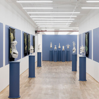
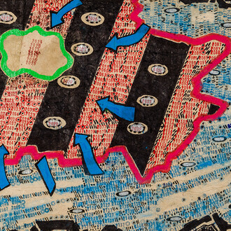
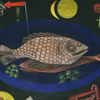
Asya Geisberg Gallery is proud to present Cover band, a group exhibition of 14 artists creating homages, satires, ripoffs and paeans to those they admire.
Art history is full of references to previous artwork, from subtle nods to full-on appropriation. For this exhibition, each artist was invited to create a work that considers this practice from the perspective of the cover song, a term borrowed from the pop-music world. A cover can shed new light on an iconic work. It can bring it back from obscurity. Sometimes it overshadows it.
A Spotify playlist of cover songs will accompany the exhibition, playing at the opening and available on the Asya Geisberg Gallery website. The public is invited to suggest additions to the list throughout the run of the show.
Participating artists include: Lisha Bai, Michael Bühler-Rose, Noa Charuvi, Byron Kim, Elisabeth Kley, Ani Liu, Fabienne Lasserre, Sharon Madanes, JJ Manford, Rebecca Morgan, Gabriel Orozco, Sara Shaoul, Barb Smith, Elisa Soliven.
Lisha Bai’s stitched fabric collages use simplified geometric shapes to depict warm, human moments, like the way the last rays of a day’s light fall into a window at dusk, after the kids have gone to bed. For her cover, Bai chose Eleonore Koch’s “Study for a dreaming palm tree.” Koch similarly took the language of concrete minimalism, often used to create disembodied abstractions, to depict the loveliness of the everyday world around her.
Michael Bühler-Rose is covering Frank Stella….sort of: the back of a Stella painting, with a botched signature and picture wire. This is the view the privileged few get; the collector, the curator, or in this case - the person taking auction-house condition report photographs. The various ways art can be “owned” is close to Bühler-Rose’s heart: he makes inimitable wood-inlay pictures, but also runs a parallel practice of art world-inspired bootleg t-shirts. This work pays homage to the studiolo - a trompe-l'oeil room that contains illusions of covetable treasures, both real and aspirational.
Inspired by her late father's occupation as an architect and her training in classical techniques, Noa Charuvi has been painting New York City’s constant state of being under construction for years. She has also worked as Marilyn Minter’s studio assistant for over a decade, helping to produce some of Minter’s most iconic images. For her cover, Charuvi chose to fuse their two practices together by depicting Minter’s painting as it was displayed by Creative Time on a billboard in Chelsea in 2006.
Byron Kim’s breakout work for the 1993 Whitney Biennial was Synecdoche, an abstract grid of single-colored canvases, which turned out to be the skin tone of each of the people who sat for their “portraits.” 30 years later, Kim returns to this subject matter through a historical prism: he has chosen to cover Josef Albers’ Homage to the Square with his own homage: a painting utilizing straight out of the tube “flesh” colors.”
Elisabeth Kley has been covering Ancient Egyptian art and Wiener Werkstätte design for much of her career. Her earthenware sculptures joyfully fuse these two aesthetics, separated by millenia, into off-kilter sculptures that sometimes moonlight as functional objects. For this show, her sculpture will pretend to be a vase, sporting Egyptian-inspired flora.
Ani Liu’s work exists in the meeting point of art and science. Her recent drawings have been inspired by internal images of breasts and astronomical images of space. Finding similarity between the outward infinity of space and the inward complexity of cellular structures she found herself thinking of Yayoi Kusama’s early Infinity nets, which led to the work on view.
Fabienne Lasserre makes massive free-standing work that is also mostly see-through, which she terms “double-sided paintings [or] 2-dimensional sculptures.'' Lasserre’s constructions exist between the realms of sculpture and painting, between being monumental and floating away. Lasserre chose to cover Helen Frankenthaler's Pour Paintings of the 60’s, in which Frankenthaler expanded the definition of abstract painting by thinning down and stretching oil paint to the point of almost disappearing.
Between 2014 and 2024 Sharon Madanes got an MFA as a painter, went to medical school, became a psychiatrist at NYC’s Bellevue Hospital, and had two children. Her paintings often hold all these identities together - a fraught balancing act between three hugely demanding and hugely fulfilling endeavors. So it’s no surprise that she chose to cover Henri Matisse, who famously said that a painting should be like a comfortable chair. Madanes recast Mattisse’s Blue window with her own office’s view of the city, the spot where she sits between patients, dreaming up her next painting.
JJ Manford usually paints rooms full of life but empty of people. His living rooms, bedrooms, and dens contain specific and invented markers of well-lived lives: good books, high and low art, and fictional rugs of his own design. For this show, Manford chose (for the first time) to focus on one singular object: an exhibition poster designed by CoBrA founder Karel Appel. Manford is interested in the translation process artists must undergo when they switch to design - paring down ideas, creating a singular image, drawing the eye in. Manford has re-translated the flat poster into his unique language of heavily textured painting.
Rebecca Morgan mines art history for the deep tracks of women’s participation in it - both as creators and muses. She then recasts herself in the central roles, painting herself into various predicaments. Previous works include trying to tame a Delacroix horse and getting stuck (naked!) inside the picture plane. Here, Morgan has taken on the ennui of Artemisia Gentileschi’s probable self portrait Mary Magdalene as melancholy, piling on headphones, Ritalin shortages, grief, work stress, and a splint. In the place of Gentileschi’s stoned, puffy eyes, Morgan’s are as wide open as Alex in Clockwork orange. She’s awake and aware - whether she wants to be or not.
Gabriel Orozco’s dry sense of humor is revealed in the way he mixes meticulously rendered geometric abstraction with the real world. You can usually spot an Orozco from a mile away, and the artist isn’t known for overt references to other artists. However, Cover band offers a rare work that is both a cover of another artist’s work, and very much outside of Orozco's signature style. Titled Spiral Pee Pee, it is of course a riff on a famous work in which geometry meets the physical world: Robert Smithson’s Spiral Jetty.
Sara Shaoul makes art from the stuff of feminism’s unfulfilled promises, especially where it comes up against motherhood and the artist’s studio. Shaoul takes moments from life that usually don’t make the cut as "Art Topics" (arguing over chores, vacuuming ) and presents them back to us like a succinct mirror. Taking her cues from Bruce Nauman’s Mapping the studio I (fat chance John Cage), as well as Mary Kelly’s Antepartum, Shaoul created an eerie, funny, and deeply relatable self-portrait using a baby monitor as her camera.
Barb Smith’s modular sculptures are abstract, poetic and mysterious, emotional but mute. Smith chose Louise Bourgeois - something of an opposite - covering Bourgeois' entangled couples - figurative, literal sculptures that often hang from the ceiling. Her version is a perfectly jointed shelving system, no surprise since Smith works as a mount-maker for the Met. It looks nothing like a Bourgeois - but look closer, and you will find small and large treasures, each telling a story of longing and entanglement.
Elisa Soliven’s ceramic works evoke both ancient sculpture and modernism’s response to it. Or maybe like a prehistoric person’s vision of the future. Soliven chose to cover a Neolithic bust, giving herself the challenge of creating a replica, with only one problem: having only seen a photograph of this object, she had to invent what it looked like from the back. Additionally, she has translated it from stone into glazed ceramic.
(Text by Gabriela Vainsencher)


